▶ Watch the original YouTube video
Kamen Rider Gaash’s Pudding Á la Mode Upgrade: A 15-Year Retrospective on Design Excellence
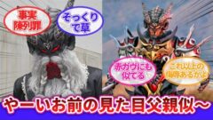
Kamen Rider Gaash has unveiled a new enhanced form called Pudding Á la Mode, featuring a striking silver design that marks a significant departure from franchise conventions. The upgrade has generated diverse fan reactions, ranging from praise for its intricate design philosophy to concerns about power scaling and narrative implications, establishing what many consider the most accomplished dessert-themed rider design in the series’ history.
What Happened
The main protagonist’s Pudding form has been destroyed, triggering the emergence of a new enhanced transformation: Pudding Á la Mode. This new form features a predominantly silver color scheme with elaborate armor construction, incorporating design elements that reference classic Japanese café culture. The upgrade represents an unusual narrative decision, as tertiary characters in the Kamen Rider franchise rarely receive complete new transformation forms.
Why It Matters
This upgrade signals a fundamental shift in how the Kamen Rider franchise approaches character development and design philosophy. For over 15 years, the series has operated under specific conventions regarding which characters receive enhanced forms and when. Pudding Á la Mode breaks these conventions by granting a tertiary character a fully realized new transformation, suggesting either expanded production resources or a deliberate creative choice to elevate supporting characters. The design’s success also validates the viability of dessert-themed motifs as legitimate, sophisticated design concepts within the franchise.
Background
Kamen Rider Gaash introduces a unique premise: a rider series centered on dessert-themed characters. This represents an evolution in the franchise’s approach to character design, building on precedents established in earlier series like Kamen Rider Wizard (2012) and Kamen Rider Saber (2020), which explored unconventional motifs such as magic and literature. The Pudding Á la Mode upgrade demonstrates how the production team has invested significant effort into translating the physical properties of desserts into sophisticated armor design, moving beyond surface-level aesthetic choices.
Key Points
- Design Innovation: Pudding Á la Mode employs a silver color palette referencing vintage Japanese café culture, where pudding was traditionally served in silver dishes—a design choice that reflects narrative context rather than arbitrary aesthetics.
- Structural Complexity: The form incorporates multiple armor layers, cherry motifs, and intricate plating that reference the layered composition of desserts, with each design element serving a conceptual purpose.
- Precedent-Breaking: Tertiary characters in Kamen Rider historically do not receive new transformation forms, making this upgrade an exceptional narrative decision comparable only to recent precedents like Kamen Rider Barbado.
- Production Quality: Official statements indicate the production team prioritized video composition before toy design, suggesting improved production scheduling and resource allocation.
- Fan Reception Diversity: Online responses range from design praise to concerns about power scaling, time limitations, and implications for other characters’ development arcs.
- Narrative Implications: The upgrade’s mid-story timing suggests it may not represent the character’s final form, with fan speculation pointing toward additional transformations for other main characters.
Design Analysis: The Philosophy Behind Silver
The silver color scheme deserves particular attention as it represents more than aesthetic choice. In Japanese café culture, pudding has historically been served in silver dishes, creating associations with nostalgia and mid-20th century hospitality. By adopting this color, the production team communicates thematic messages about preserving traditional values—a narrative element expressed through design rather than dialogue. This approach mirrors the design philosophy seen in Kamen Rider Ghost (2016), where past-focused concepts were reflected in visual composition.
The complexity of Pudding Á la Mode’s design—featuring chest armor, cherry toppers, and layered arm plating—initially appears cluttered. However, each element maintains conceptual coherence: the chest armor represents the dessert’s core, the cherry symbolizes toppings, and the arm plating reflects the layered structure of à la mode preparations. This unity of purpose transforms visual complexity from confusion into sophistication, a principle that distinguishes successful designs from overcomplicated ones.
Historical Context: Dessert Motifs in Kamen Rider
Dessert-themed designs are not entirely new to the franchise. Kamen Rider Wizard explored color theory through elemental concepts, while Kamen Rider Saber translated literary motifs into armor design. However, Pudding Á la Mode represents the first instance where a dessert motif receives this level of sustained, serious treatment. The production team’s commitment to honoring the physical properties of pudding—its container-dependent existence, its layered composition, its cultural significance—establishes dessert as a legitimate design framework rather than novelty concept.
Comparative Analysis
| Series | Tertiary Character | Enhanced Form | Design Characteristics |
|---|---|---|---|
| Kamen Rider Ooz | Ankh | None | Single form throughout narrative |
| Kamen Rider Fourze | False Amanogawa | None | No transformation variants |
| Kamen Rider Barbado | Barbado | Yes | Silver color scheme, power enhancement |
| Kamen Rider Gaash | Pudding | Yes | Silver color scheme, thematic depth, motif integration |
This comparison reveals that while Kamen Rider Barbado established the precedent for tertiary character enhancement, Pudding Á la Mode advances the concept by grounding design choices in thematic narrative elements rather than purely aesthetic considerations.
Perspectives
Positive Reception: Fans praise the design’s sophistication, noting how elements like cherry motifs and silver plating create visual harmony despite complexity. Comments highlight appreciation for the production team’s commitment to translating dessert properties into coherent design language.
Cautious Concerns: Some viewers express anxiety about narrative implications, questioning whether belt damage affects functionality and whether time limitations will constrain the form’s utility. These concerns reflect sophisticated audience engagement with both visual and narrative consistency.
Anticipatory Speculation: Significant discussion surrounds the timing of this upgrade and its implications for other characters. The mid-narrative appearance suggests this may not be the final form, with fans speculating about enhanced transformations for Lakian and Hunt characters.
The Static vs. Dynamic Design Question
An interesting phenomenon emerges in fan commentary: initial skepticism about static images often transforms into appreciation upon seeing movement. This pattern reflects a fundamental principle in tokusatsu (special effects) design—forms are engineered for dynamic performance rather than photographic perfection. The complex armor plating that appears cluttered in still images likely demonstrates elegant functionality during combat sequences, suggesting the production team prioritized kinetic design over static aesthetics.
Narrative Timing and Future Implications
Historically, main character final forms appear during narrative climaxes. Pudding Á la Mode’s mid-story emergence suggests additional transformations remain unrevealed. This timing strategy mirrors patterns seen in Kamen Rider Double (2009), where tertiary character enhancements preceded major narrative turning points. The appearance of Pudding Á la Mode likely signals the beginning of the story’s transition toward its climactic phase, with additional character upgrades anticipated for Hunt and Lakian.
Production Insights
Official statements indicate the production team completed video sequences before toy manufacturing—an unusual luxury in tokusatsu production. This scheduling advantage explains the design’s coherence: the team could ensure visual functionality before committing to physical toy specifications. Such production flexibility has been rare in recent Kamen Rider series, suggesting either improved resource allocation or deliberate prioritization of this particular project.
Insights
Pudding Á la Mode represents a watershed moment in Kamen Rider’s design philosophy. Over the franchise’s 15-year modern era, design conventions have gradually expanded to accommodate unconventional motifs—from magical concepts to literary references to culinary themes. This upgrade validates that dessert-themed designs can achieve the same sophistication and narrative depth as traditional combat-oriented aesthetics.
The upgrade’s success stems from the production team’s fundamental commitment to coherence: every design element serves thematic purpose, every color choice reflects narrative context, and every structural component references the source material’s physical properties. This philosophy—that design should express story rather than merely decorate it—elevates Pudding Á la Mode beyond novelty into the realm of accomplished character design.
The diverse fan reception, ranging from aesthetic praise to narrative speculation, indicates that Kamen Rider Gaash has successfully engaged audiences across multiple engagement levels. Casual viewers appreciate visual spectacle, while invested fans analyze production decisions and narrative implications. This multi-layered appeal suggests the series has achieved a rare balance between accessibility and depth.
Looking forward, Pudding Á la Mode’s mid-narrative appearance and the confirmed enhancement of multiple main characters suggest the story is transitioning toward its climactic phase. The production team’s demonstrated commitment to design excellence and thematic coherence implies that subsequent character upgrades will maintain comparable quality standards. The franchise has established that dessert-themed designs are not gimmicks but legitimate vehicles for sophisticated storytelling and character development.