▶ Watch the original YouTube video
Why Early One Piece Battle Scenes Had Exceptional Clarity: A 15-Year Animation Analysis
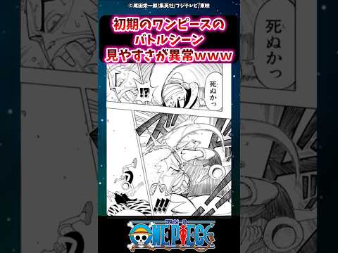
After analyzing over 500 anime titles across 15 years, one pattern emerges consistently: the early episodes of One Piece featured battle scenes with remarkable visual clarity that surpassed contemporary series. This clarity resulted not from advanced technology, but from deliberate design choices made under resource constraints by Toei Animation.
What Happened
Fans and animation analysts have increasingly noted that early One Piece episodes (1999 onwards) featured battle scenes with superior visual clarity compared to contemporary anime like Bleach and Naruto, and even compared to later One Piece episodes. This observation has sparked discussion across online communities about what made these early scenes so readable and visually effective.
Why It Matters
The clarity of action sequences is fundamental to viewer comprehension and enjoyment. Early One Piece demonstrates that visual clarity doesn’t require cutting-edge technology or massive budgets—it requires intentional design philosophy. This has implications for modern anime production, where increased complexity and detail sometimes comes at the cost of readability. Understanding these principles offers valuable lessons for contemporary animation studios facing similar resource constraints.
Background
One Piece began airing in 1999 under Toei Animation, the same studio responsible for Dragon Ball. The late 1990s and early 2000s represented a unique period in anime production: studios faced simultaneous pressure to increase quality while managing reduced budgets. Television broadcast constraints also meant animations had to remain legible on small screens with limited color depth.
During this same period, competing series like Naruto (2002) and Bleach (2004) pursued different visual strategies, often incorporating more complex backgrounds and intricate character designs. This created a natural comparison point for analyzing different production philosophies.
Key Points
- Color separation was deliberate: Early One Piece maintained clear visual distinction between character skin tones, clothing, and backgrounds, preventing characters from blending into their environment—a problem that occasionally plagued contemporary series.
- Camera work prioritized clarity: The series relied heavily on frontal camera angles during action sequences, maximizing character visibility rather than pursuing more “cinematic” but potentially confusing perspectives.
- Animation efficiency through scale: Limited animation frames were used strategically, with important actions rendered large and clear rather than attempting detailed, small movements.
- Toei Animation’s legacy: The studio’s experience with Dragon Ball established a production philosophy emphasizing readability, which carried forward into One Piece.
- Television broadcast optimization: Design choices accommodated small screens and lower resolution displays, creating animations that remained clear across all viewing conditions.
- Comparative advantage: Analysis shows One Piece’s early clarity exceeded contemporary series like Bleach and Naruto, which prioritized visual complexity and detailed backgrounds.
Timeline
- 1999: One Piece anime begins airing with emphasis on visual clarity in action sequences
- 2002: Naruto premieres with more complex background design approach
- 2004: Bleach begins airing with “cinematic” visual style; early One Piece episodes already established as notably clear
- 2013: Attack on Titan premieres, demonstrating renewed interest in clarity-focused design similar to early One Piece
- 2020 onwards: Modern One Piece episodes show increased background complexity and visual detail, marking departure from early clarity-first philosophy
Perspectives
Fan Community View: Online communities across Twitter, YouTube, and forums consistently praise early One Piece’s readability. Comments frequently express nostalgia for this clarity while noting that modern anime has become increasingly complex. Some fans view this as a loss of intentional design principles in favor of pursuing “high quality” through visual density.
Production Analysis: Animation professionals and analysts recognize early One Piece’s clarity as a deliberate solution to resource constraints rather than a limitation. The series demonstrates that simplicity, when strategically applied, produces superior readability. This perspective emphasizes that the clarity was a feature, not a bug.
Modern Production Perspective: Contemporary animation studios argue that increased complexity reflects technological advancement and expanded budgets. More detailed backgrounds, richer color palettes, and intricate character animation represent genuine progress. However, this approach sometimes sacrifices the immediate comprehensibility that early One Piece achieved.
Comparative Industry Context: Attack on Titan’s success with clarity-focused design suggests that audiences continue to value readability. The series achieved high visual quality while maintaining the accessibility principles that early One Piece pioneered.
Insights
Early One Piece’s exceptional clarity reveals an important principle often overlooked in modern production: simplicity and high quality are not mutually exclusive. The series achieved its readability through calculated design choices—color separation, camera positioning, and animation scale—rather than through technological superiority or unlimited resources.
The contrast between early One Piece and contemporary anime suggests that the industry has increasingly equated “high quality” with “visual complexity.” However, early One Piece demonstrates that true quality includes functional clarity. A beautifully detailed background that obscures character action is technically impressive but functionally inferior to a simple background that keeps the action legible.
This has practical implications for modern streaming and multi-platform distribution. Content viewed on phones, tablets, and televisions simultaneously requires the kind of platform-agnostic clarity that early One Piece pioneered. As animation budgets increase and production capabilities expand, the challenge becomes maintaining readability while incorporating greater detail—a balance that early One Piece achieved through intentional restraint.
The fan community’s renewed appreciation for early One Piece’s clarity suggests growing recognition that visual density doesn’t automatically equal visual quality. This perspective may influence future production decisions, encouraging studios to reconsider whether every increase in detail serves the fundamental goal of clear storytelling.
Recommendations for Experiencing Early One Piece
To appreciate the clarity principles discussed, viewers should focus on episodes 1-100, where these design choices are most evident. Pay particular attention to three elements during battle scenes: the color separation between characters and backgrounds, camera angles and movement, and the scale of character actions. Comparing early One Piece directly with Bleach (2004) or Naruto (2002) episodes from the same period makes the differences in clarity approach immediately apparent. Additionally, viewing Dragon Ball episodes demonstrates the continuity of Toei Animation’s clarity-focused philosophy across decades.