▶ Watch the original YouTube video
Gundam SEED Freedom’s Impulse Spec2 Color Redesign Sparks Fan Debate Over Visual Strategy
The theatrical release of Gundam SEED Freedom has reignited a long-standing debate within the Gundam fan community over the Impulse Spec2’s dramatic color redesign. The shift from muted tones to more vibrant hues has divided viewers, raising questions about whether such changes serve cinematic impact or are primarily driven by merchandise strategy.
What Happened
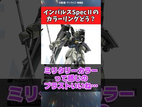
The Impulse Spec2, a mobile suit featured in the theatrical release of Gundam SEED Freedom, has undergone significant color modifications compared to its television counterparts. The red sword and green blast components have been shifted to more vivid, saturated tones, while the Force unit has transitioned from cyan to a more standard Gundam color palette. These changes have generated substantial discussion across fan communities, with viewers expressing both appreciation and skepticism about the redesign.
Why It Matters
Color redesigns in theatrical Gundam releases represent a critical intersection between artistic vision and commercial strategy. The Impulse Spec2 case illuminates how production teams balance cinematic presentation with fan expectations and merchandise viability. Understanding these design decisions provides insight into how major anime franchises approach multi-platform storytelling and the challenges of maintaining visual consistency across different media formats.
Background
The Impulse Gundam first appeared in Mobile Suit Gundam SEED Destiny (2005), where its distinctive red and blue two-tone coloring made a significant impression on audiences. The original design featured modular face systems that could be swapped to alter the mobile suit’s appearance and capabilities. Now, nearly two decades later, the Impulse Spec2 represents an evolution of this concept, introducing more dramatic color variations tied to its face-shift functionality.
Color redesigns in theatrical Gundam releases are not unprecedented. Previous examples include the Wing Gundam’s enhanced white coloring in New Mobile Report Gundam Wing’s theatrical release, the 00 Gundam’s transformation to gold in Gundam 00: A Wakening of the Trailblazer, and the Unicorn Gundam’s more vivid red and gold palette in Mobile Suit Gundam Unicorn RE:0096. Each of these changes sparked similar debates about artistic necessity versus fan preference.
Key Points
- Significant color intensification: The Impulse Spec2’s red sword and green blast components feature more saturated, vibrant tones designed to maximize visual impact on large theatrical screens.
- Face-shift color dynamics: The mobile suit’s color-changing face-shift mechanism has been praised by fans as an innovative design element that merges mechanical function with visual storytelling.
- Cinematic optimization strategy: Production comments suggest the color changes were deliberately implemented to create lasting visual impressions during the film’s 30-minute combat sequences.
- Military aesthetic shift: The redesign reflects a broader trend in recent Gundam series toward more realistic, militaristic color palettes rather than vibrant, stylized schemes.
- Merchandise considerations: The color choices appear designed to optimize both theatrical presentation and subsequent plastic model kit sales, a critical revenue stream for the franchise.
- Narrative positioning questions: Fan discussions have raised concerns about the Impulse Spec2’s actual combat importance and story relevance, with some noting it functions primarily as a test unit rather than a primary combat asset.
Fan Reactions Analyzed
Positive Reception: Several fans praised the new color scheme, particularly the green blast component. Comments like “the military-colored blast looks great” and “the face-shift color change is undeniably cool” indicate appreciation for the more grounded aesthetic and dynamic color mechanics. The face-shift functionality’s color variations garnered particular enthusiasm, with viewers recognizing it as a meaningful design evolution.
Skeptical Response: Other fans expressed preference for the original color palette, with some noting that the previous red sword coloring felt more cohesive with the mobile suit’s overall design. Concerns were also raised about the Force unit’s color change, with some viewers suggesting the redesign didn’t go far enough in unifying the color scheme.
Mechanical and Narrative Questions: Beyond aesthetic concerns, fans questioned the Impulse Spec2’s strategic importance within the film’s narrative, with one comment noting it was “just picked up from the moon and used for testing.” This raises questions about whether the color redesign was narratively justified or primarily a commercial decision.
Design Strategy Comparison
Analyzing color redesigns across theatrical Gundam releases reveals distinct patterns. Successful redesigns—such as the Unicorn Gundam and Strike Gundam—typically involved intensifying existing color schemes rather than fundamentally altering them. Less successful redesigns—like the Wing Gundam and 00 Gundam—introduced more dramatic color shifts that conflicted with fan attachment to original designs.
The Impulse Spec2 falls into a middle category. The red and green intensification mirrors successful precedents, but the Force unit’s shift to standard Gundam colors represents a more substantial change. This hybrid approach may explain the mixed fan response.
Broader Industry Trends
Military Color Palette Adoption: Since Mobile Suit Gundam: The Witch from Mercury, the franchise has increasingly favored realistic, militaristic color schemes over vibrant, stylized designs. The Impulse Spec2’s darker green blast component reflects this industry-wide shift toward visual authenticity.
Cinematic Color Optimization: Theatrical releases increasingly employ color adjustments specifically calibrated for large-screen presentation. Television broadcasts and theatrical releases now operate as distinct visual environments, each requiring different color specifications to achieve optimal visual impact.
Dynamic Color as Narrative Tool: Modern Gundam designs increasingly use color changes to communicate mechanical state and functional transformation. The Impulse Spec2’s face-shift color variations represent a maturation of this approach, transforming color from a static design element into a dynamic storytelling device.
Merchandise and Commercial Implications
The color redesign strategy appears closely tied to plastic model kit sales, a primary revenue driver for the Gundam franchise. The theatrical color palette is specifically designed to create visual memorability that translates into consumer interest. When fans later assemble model kits, the theatrical color reference becomes a purchasing and customization guide.
This dual-platform approach—optimizing colors for both theatrical presentation and merchandise viability—represents a sophisticated but sometimes contentious strategy. While it maximizes commercial impact, it can create disconnect for fans who experience the mobile suit in different contexts with different color presentations.
Insights
The Impulse Spec2 color redesign exemplifies a fundamental tension in modern anime production: balancing artistic vision, fan expectations, and commercial imperatives across multiple distribution platforms. The debate is not merely about aesthetic preference but reflects deeper questions about how franchises should evolve while respecting established fan relationships with character designs.
The positive reception of the face-shift color mechanics suggests fans are willing to accept redesigns when they serve clear narrative or mechanical purposes. However, changes perceived as purely commercial face resistance, particularly when they alter beloved original designs.
Looking forward, the Impulse Spec2 case demonstrates that theatrical Gundam releases will continue experimenting with color optimization for cinematic presentation. The franchise’s success will likely depend on whether future redesigns can better integrate commercial strategy with narrative justification, creating changes that feel organic to the story rather than imposed by merchandise considerations.
The broader implication is that as anime increasingly pursues theatrical releases, the visual language of character and mechanical design will necessarily evolve to accommodate different presentation formats. Fans and creators alike must develop shared understanding that theatrical and broadcast versions may legitimately differ, each optimized for its respective medium.