▶ Watch the original YouTube video
Why Kachidoki Arms’ Design Cohesion Resonates: A Deep Analysis of Kamen Rider Gaim’s Masterpiece
Kachidoki Arms from Kamen Rider Gaim has become a benchmark for unified design in tokusatsu (live-action special effects) productions. Through careful color management, visual weight, and motif integration, this final form achieves what many complex designs fail to accomplish: perfect balance between intricacy and coherence.
What Happened
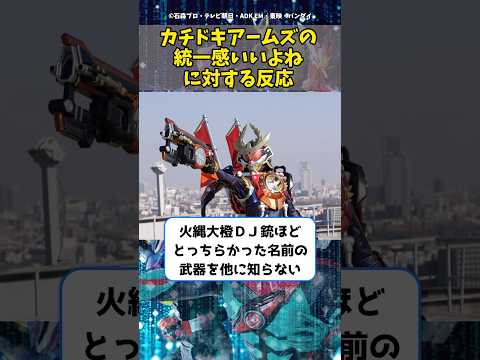
Kachidoki Arms emerged as the defining final form in Kamen Rider Gaim, a series built on the concept of combining multiple fruit-themed armor pieces. Unlike earlier Arms that emphasized individual fruit motifs with distinct color schemes, Kachidoki Arms unified multiple design elements—fruit, DJ turntable, and additional motifs—into a single cohesive form. Fan reception has been overwhelmingly positive, with viewers consistently praising its visual harmony, perceived strength, and design sophistication.
Why It Matters
Kachidoki Arms represents a critical achievement in tokusatsu design philosophy: solving the challenge of visual unity within complexity. For production designers, this form demonstrates how limiting color palettes and maintaining consistent armor structure can create a sense of completion and authority. For fans, it exemplifies how visual design directly reinforces narrative strength—the form looks powerful because it is powerful. This alignment between aesthetics and function has made Kachidoki Arms a reference point for subsequent Kamen Rider series and broader tokusatsu design practices.
Background
Kamen Rider Gaim introduced a transformation system where the protagonist combines different fruit-themed Arms to gain various powers. Early in the series, each Arms featured distinct colors reflecting its fruit motif: Watermelon Arms in green, Banana Arms in yellow, Pineapple Arms in yellow. This visual diversity created a fragmented aesthetic. As the narrative progressed toward a climactic final form, the production team faced a fundamental design challenge: how to integrate multiple motifs while maintaining visual coherence. Kachidoki Arms answered this question through deliberate color restriction (orange and black) and unified armor construction, establishing itself as the series’ design pinnacle.
Key Points
- Color Unity as Foundation: Kachidoki Arms employs a limited palette of orange and black, restricting visual noise while accommodating multiple design elements
- Visual Weight and Authority: The form conveys strength through armor volume and material texture, creating immediate visual authority that aligns with its narrative power level
- Motif Integration Without Fragmentation: Despite combining fruit, DJ, and other design references, the form avoids the visual scatter that plagued earlier multi-motif attempts like DJ10
- Narrative-Design Alignment: The form’s visual sophistication directly reflects its in-story function as the protagonist’s ultimate power-up, creating narrative coherence
- Functional Complexity: Complex details like the flag element enhance character identity without appearing cumbersome or visually distracting
- Design Benchmark Status: The form has become a reference standard for how to balance complexity and unity in tokusatsu design
Design Analysis: The Secret to Cohesion
The foundation of Kachidoki Arms’ success lies in two deliberate design principles: color management and visual weight consistency. In tokusatsu design, color serves as the primary tool for creating visual unity. Kachidoki Arms restricts itself to orange and black—a dramatic departure from the multi-colored Arms that preceded it. This constraint forces every design element to work within a unified visual framework, preventing the scattered appearance that undermined earlier forms.
Comparable to Infinity Style from Kamen Rider Wizard, which unified complex details through white, black, and gold accents, Kachidoki Arms demonstrates that limiting color options paradoxically increases design sophistication. The restricted palette allows viewers to focus on form and structure rather than being overwhelmed by chromatic variety.
Beyond color, the form’s visual weight—conveyed through armor volume, panel lines, and material texture—creates a sense of density and authority. This heaviness serves a dual purpose: it visually communicates the form’s power level while creating a sense of completion. Earlier Arms, despite their individual appeal, often appeared lightweight or incomplete. Kachidoki Arms feels definitive.
Comparative Analysis Within the Series
Examining Kachidoki Arms against other Arms in Kamen Rider Gaim reveals its unique position:
| Arms Form | Color Unity | Visual Weight | Motif Complexity | Design Completion |
|---|---|---|---|---|
| Watermelon Arms | High (green/red) | Low | Low (single motif) | Medium |
| Banana Arms | High (yellow) | Low | Low (single motif) | Medium |
| DJ10 | Low (mixed colors) | Medium | High (fruit + DJ) | Low |
| Kachidoki Arms | High (orange/black) | High | High (integrated motifs) | High |
DJ10 represents an instructive counterpoint. While it attempted to combine fruit and DJ motifs—similar to Kachidoki Arms—it failed to achieve visual unity. The form’s scattered color scheme and inconsistent armor structure created what fans describe as “poor pacing” in visual presentation. Kachidoki Arms solved this identical challenge through superior color discipline and structural consistency, demonstrating that complexity itself is not the problem; poor execution is.
Alignment of Visual Design and Narrative Strength
A critical principle in tokusatsu design is that visual authority must align with narrative power. When this alignment breaks, viewers experience cognitive dissonance. Kachidoki Arms achieves perfect synchronization: the form looks powerful because its design communicates authority through color restriction, visual weight, and structural sophistication. Simultaneously, the narrative positions it as the protagonist’s ultimate power-up capable of overwhelming earlier opponents.
Fan commentary consistently reflects this alignment. Statements like “this alone can one-shot most enemies” and “finally the protagonist has a decisive power advantage” indicate that viewers accept the form’s strength as visually justified. The design does not require narrative explanation; the aesthetics themselves convey capability.
This contrasts with forms where visual and narrative strength diverge. When such misalignment occurs, audiences question the design’s credibility, regardless of in-story justification. Kachidoki Arms avoids this trap entirely through unified design execution.
Production Intent and Design Philosophy
The creation of Kachidoki Arms reflects deliberate production decisions addressing a core series challenge. Kamen Rider Gaim’s early episodes emphasized the joy of combining multiple Arms, celebrating variety and experimentation. However, narrative progression demanded a definitive final form—a singular, ultimate expression of the protagonist’s power. This transition required solving a design paradox: how to create a form that feels complete and authoritative while incorporating the series’ core multi-motif concept.
The production team’s solution involved four key principles:
- Color Limitation: Restricting the palette to two colors ensured visual coherence despite multiple design elements
- Armor Structure Unification: Maintaining consistent design language across all components created visual continuity
- Visual Weight Emphasis: Increasing armor volume and density conveyed finality and authority
- Functional Refinement: Ensuring complex details enhanced rather than hindered visual presentation
These principles align with design approaches seen in other tokusatsu final forms, such as Ultimate Rider from Kamen Rider Ryuki, which unified multiple motifs through restricted color schemes (black and gold) while maintaining visual sophistication.
Fan Reception and Evaluation Criteria
Analysis of viewer commentary reveals the criteria fans use when evaluating tokusatsu design:
Visual Harmony as Priority: Comments emphasizing “color unity and visual weight” indicate that fans prioritize aesthetic coherence over novelty or complexity. This reflects a sophisticated understanding that design excellence emerges from restraint rather than accumulation.
Design-Strength Alignment: Statements about the form’s combat effectiveness demonstrate that fans evaluate design through functional narrative logic. A powerful form must look powerful; weakness in either dimension creates dissatisfaction.
Functional Complexity: Observations about design elements like the flag being “strong yet unobtrusive” reveal that fans appreciate intricate details that enhance character identity without creating visual clutter. This indicates appreciation for sophisticated design thinking rather than simple minimalism.
Collectively, fan responses demonstrate that tokusatsu audiences employ advanced aesthetic criteria, valuing the intersection of visual sophistication, narrative function, and design coherence.
Implications for Tokusatsu Design
Kachidoki Arms has established itself as a design benchmark for subsequent tokusatsu productions. When contemporary series like Kamen Rider Saber and Kamen Rider Revice developed their final forms, designers could reference Kachidoki Arms as a solution to the challenge of unifying complex motifs. The form demonstrates that visual authority emerges not from accumulation but from disciplined execution of core design principles.
The broader implication is that tokusatsu design excellence requires understanding the relationship between constraint and sophistication. Limiting color palettes, maintaining structural consistency, and emphasizing visual weight create forms that feel complete and authoritative. This principle applies beyond tokusatsu to any design discipline where complexity must be reconciled with unity.
However, one tension remains evident in fan commentary. The observation that “the protagonist’s strength is essentially a bug” suggests potential imbalance in the series’ power scaling. Kachidoki Arms’ necessity as a power-up capable of establishing protagonist dominance may indicate that baseline character strength was calibrated too high, requiring an exceptional form to restore narrative balance. This raises questions about whether the form’s design excellence compensates for or masks underlying narrative structure issues.
Conclusion
Kachidoki Arms represents the pinnacle of tokusatsu design achievement: the successful integration of complexity and unity. Its evaluation as a masterpiece stems not from individual elements but from the complete execution of design philosophy. The form demonstrates that visual sophistication emerges from disciplined constraint—limited color palettes, unified armor structure, and consistent visual weight create authority more effectively than accumulation.
The form’s enduring status as a design reference reflects its success in solving a fundamental challenge: how to create a final form that feels complete, authoritative, and narratively justified while incorporating the series’ core multi-motif concept. For tokusatsu designers and broader design practitioners, Kachidoki Arms remains a textbook example of how constraint generates sophistication and how visual design must align with narrative function to achieve coherence.