▶ Watch the original YouTube video
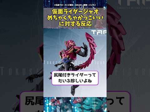
Kamen Rider Jao has sparked overwhelming praise from fans across social media for its groundbreaking design. A longtime series enthusiast with over 15 years of viewing experience breaks down why this new rider’s asymmetrical silhouette, purple-and-gold color scheme, and refined complexity represent a watershed moment for the franchise.
What Happened
The reveal of Kamen Rider Jao has generated exceptional fan enthusiasm, with viewers across YouTube, Twitter, and other platforms describing the design as “incredibly cool” and praising its innovative departure from traditional rider aesthetics. The character’s introduction marks a significant moment in the Reiwa-era Kamen Rider series, which began with Kamen Rider Zero-One and has continued to evolve the franchise’s visual language.
Why It Matters
Kamen Rider Jao represents more than just a new character design—it signals the franchise’s maturation and commitment to appealing to adult audiences alongside younger viewers. The design’s success demonstrates how Japanese tokusatsu (special effects) productions are advancing their aesthetic sophistication to compete in a global entertainment market. For longtime fans, Jao exemplifies how the series continues to innovate while maintaining its core identity across nearly five decades of evolution.
Background
The Kamen Rider franchise, which debuted in 1971, has undergone distinct design philosophies across five major eras. The original Showa-era riders featured simple geometric patterns and clear color blocking. The early Heisei period introduced mechanical complexity through advancing CGI technology. The mid-Heisei era emphasized individual character identity, while the late Heisei period (from Kamen Rider Ooos onward) integrated explicit thematic elements into visual design—coins, celestial bodies, magical symbols, and chemical structures became visual storytelling tools. The current Reiwa era, beginning with Zero-One, synthesizes these approaches while pursuing new aesthetic directions.
Key Points
- Jao’s asymmetrical armor design breaks from the left-right symmetry that has defined most Kamen Rider aesthetics since the franchise’s inception
- The purple-and-gold color palette is unprecedented in the series and conveys sophistication, authority, and mystery—a deliberate shift toward adult appeal
- The design achieves high visual complexity while maintaining compositional unity, demonstrating advanced design technique
- Fan response indicates strong appreciation for both the innovation and the refined execution, with praise spanning both new and veteran audiences
- The design reflects industry trends toward “adultification” of tokusatsu and adaptation to modern CGI capabilities
- Jao’s aesthetic appears calibrated for global market appeal, incorporating Eastern visual philosophy in contemporary form
Design Evolution Timeline
- 1971–1989 (Showa Era): Simple geometric patterns, clear color separation, symbolic rather than mechanical design
- 2000–2005 (Early Heisei): Introduction of mechanical complexity and CG-influenced aesthetics with Kamen Rider Kuuga
- 2005–2010 (Mid-Heisei): Emphasis on individual character identity and diverse design philosophies across titles
- 2010–2019 (Late Heisei): Integration of explicit thematic elements into visual design; each rider embodies its series’ central concept
- 2019–Present (Reiwa Era): Synthesis of previous approaches with pursuit of new visual language; Jao represents a refinement of this direction
Design Analysis: The Psychology of “Coolness”
From a design psychology perspective, Jao’s appeal operates through three distinct mechanisms. First, it balances complexity with order—the design maintains high visual intricacy while the purple-and-gold color scheme organizes the armor into a coherent visual hierarchy, communicating calculated sophistication rather than chaotic detail. Second, the asymmetrical armor placement creates dynamic tension; unlike symmetrical designs that convey stability, asymmetry suggests motion and readiness for action. Third, the color psychology of purple and gold carries associations with power, luxury, and mystique—a deliberate distinction from the red-and-black or blue-and-black combinations that dominate the franchise’s history.
Compared to recent predecessors, Jao achieves what previous designs approached but did not fully realize. Kamen Rider Build (2017–2018) demonstrated that extreme complexity could maintain visual coherence, but Jao refines this principle further. The design’s refinement suggests that modern CGI technology has enabled a new threshold of visual sophistication in tokusatsu production.
Industry Context and Strategic Intent
Several industry trends converge in Jao’s design. The Reiwa-era Kamen Rider series has explicitly shifted from children’s programming toward all-ages entertainment, as evidenced by Zero-One’s exploration of AI ethics and labor philosophy. Jao’s sophisticated aesthetic—the refined color palette, the complex but organized armor—signals this “adultification” strategy visually. Additionally, the franchise’s expanding Asian market presence likely influenced the purple-and-gold palette, which draws on Eastern aesthetic traditions while remaining contemporary.
The design also reflects technological capability. Modern CGI and practical effects fusion have reached a level where intricate armor designs like Jao’s can be rendered seamlessly in both digital and physical media, whereas such complexity would have been impractical in earlier production eras.
Fan Reception Analysis
Social media responses to Jao cluster around three themes. First, fans express surprise at the design’s novelty—Jao defies audience expectations formed by previous rider designs, creating a sense of discovery. Second, fans emphasize design completeness; the innovation is not merely new but executed at high technical quality. Third, responses reflect elevated aesthetic standards among contemporary tokusatsu audiences, who evaluate design with greater sophistication than previous fan generations.
Insights
Kamen Rider Jao’s reception suggests that the franchise has successfully transitioned into a new maturity phase. The design synthesizes 50 years of aesthetic evolution—the simplicity of Showa-era riders, the mechanical sophistication of early Heisei, the thematic integration of late Heisei, and the unified vision of the Reiwa era—while establishing a new visual language. This achievement indicates that Japanese tokusatsu has secured its position as sophisticated entertainment capable of satisfying both longtime enthusiasts and new audiences.
The critical question moving forward is whether Jao represents a singular achievement or the establishment of a new standard. If subsequent Reiwa-era riders maintain and develop Jao’s aesthetic principles, the franchise will have entered a sustained period of elevated design sophistication. If Jao remains an isolated masterpiece, it will represent a missed opportunity for systematic advancement.
For the broader tokusatsu industry, Jao demonstrates that special effects productions can achieve visual refinement comparable to high-end animation and digital media while maintaining their distinctive practical-effects character. This positions tokusatsu as a viable medium for adult audiences and international markets—a significant evolution for a genre historically positioned as children’s entertainment.