▶ Watch the original YouTube video
How Strike Color Transforms Duel Gundam’s Visual Identity: A 15-Year Fan Analysis
A viral video exploring what happens when Duel Gundam receives Strike Gundam’s iconic white, blue, and red color scheme reveals how color choices fundamentally reshape the perception of mecha design. Drawing from 15 years of Gundam fandom and analysis of similar design transformations across the franchise, this deep dive examines how a simple color change can alter a mobile suit’s narrative role and visual identity.
- What Happened
- Why It Matters
- Background
- Key Points
- The Design Connection Between Duel and Strike
- Color Psychology and Viewer Perception
- Community Response and Interpretation
- Design Principles and Frame Exposure
- Comparative Analysis Across Gundam Series
- Broader Implications for Mecha Design
- Practical Applications for Fans and Builders
- Future Possibilities and Narrative Potential
- Insights and Conclusions
What Happened
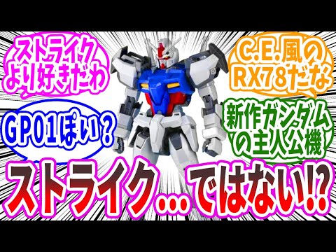
A video demonstration showing Duel Gundam painted in Strike Gundam’s signature tricolor scheme (white, blue, and red) has sparked widespread discussion in the Gundam fan community. Despite sharing the same frame and mechanical structure, the recolored Duel appears to be an entirely different mobile suit—prompting viewers to speculate about design philosophy, color psychology, and the narrative implications of visual identity in mecha design.
Why It Matters
This phenomenon reveals a fundamental principle in mechanical design: color is not merely aesthetic decoration but a critical communicative tool that shapes viewer perception and narrative understanding. In the Gundam franchise, where multiple mobile suits often derive from the same base frame, color serves as a primary signal for faction allegiance, narrative role, and design intent. Understanding how color transforms perception has implications for design theory, color psychology, and how audiences interpret visual media.
Background
Duel Gundam and Strike Gundam are central to the Mobile Suit Gundam SEED series, which introduced the revolutionary concept of multiple mobile suits derived from a single base frame—the GATX series. Both machines share identical internal structures but present vastly different visual impressions through their color schemes and equipment configurations. Strike Gundam, piloted by protagonist Kira Yamato, features the tricolor scheme (white, blue, red) that evokes the original Mobile Suit Gundam. Duel Gundam, piloted by antagonist Yzak Joule, uses magenta and gray coloring that clearly identifies it as a ZAFT military machine.
The concept of frame-sharing across multiple mobile suits became a defining characteristic of SEED, representing a 21st-century reimagining of the original Gundam’s design philosophy. This design approach allows for visual differentiation while maintaining mechanical compatibility—a principle that extends beyond SEED to other Gundam series including Gundam 00, Gundam UC, and Gundam AGE.
Key Points
- Dramatic Visual Transformation: Recoloring Duel Gundam in Strike’s tricolor scheme creates the impression of an entirely different mobile suit despite identical mechanical structure
- Facial Expression Shift: The mask’s downturned expression appears less menacing and more heroic when rendered in lighter colors, demonstrating how color influences perceived emotion
- Prototype Perception: Viewers consistently describe the recolored Duel as resembling a prototype Strike or even a SEED-era interpretation of the original Gundam
- Narrative Role Reassignment: The color change triggers unconscious reassessment of the mobile suit’s faction allegiance and story function
- Design Intent Revelation: The transformation exposes underlying design connections between Duel and Strike that the original color scheme obscures
- Psychological Reframing: Viewers naturally imagine different weapons, equipment configurations, and story scenarios for the recolored machine
The Design Connection Between Duel and Strike
Duel Gundam and Strike Gundam represent a deliberate design pairing within SEED’s narrative structure. While Strike embodies the protagonist’s journey and ideals, Duel serves as a contrasting force—mechanically equivalent but visually and narratively distinct. The original magenta and gray color scheme effectively communicates Duel’s role as a ZAFT machine and emphasizes its aggressive, militaristic character.
However, Duel’s design contains subtle elements that hint at its shared heritage with Strike. The exposed frame sections visible on Duel suggest a more prototype-like construction compared to fully armored mobile suits. When recolored in Strike’s tricolor scheme, these exposed frame areas take on new meaning, evoking the aesthetic of the original Mobile Suit Gundam from 1979—a visual callback that appears intentional given SEED’s positioning as a modern reimagining of the original series.
This design relationship extends across multiple Gundam series. In Gundam 00, the Gundam Exia undergoes similar transformations, with different color schemes signaling different narrative phases and roles. In Gundam UC, the Unicorn Gundam’s multiple color modes directly correspond to different operational states and story functions. These examples demonstrate that color-based differentiation is a deliberate design strategy throughout the Gundam franchise.
Color Psychology and Viewer Perception
The dramatic shift in perception when Duel receives Strike’s colors reflects established principles in color psychology. The tricolor scheme of white, blue, and red carries strong cultural associations with justice, order, and heroism across Western and Japanese contexts. Magenta and gray, by contrast, suggest coldness, otherness, and military precision.
When viewers see Duel in tricolor, their brains unconsciously apply the cognitive frame associated with those colors—triggering associations with protagonist machines, allied forces, and heroic narratives. This occurs without conscious deliberation, suggesting that color functions as a pre-linguistic communicative system in visual media.
Frame theory from cognitive psychology explains this phenomenon: humans interpret new information through existing conceptual frameworks. The tricolor scheme activates the “protagonist mobile suit” framework, causing viewers to reinterpret Duel’s design elements through this lens. The same downturned mouth expression that reads as menacing in magenta appears determined or resolute in white and blue.
Community Response and Interpretation
The video’s comment section reveals consistent patterns in viewer interpretation. The most frequent observation describes the recolored Duel as resembling a “Proto-Strike”—a prototype version of the protagonist machine. This interpretation is remarkably accurate, as Duel’s design does incorporate design concepts from Strike’s development phase.
Multiple viewers noted that the recolored Duel resembles the original Mobile Suit Gundam rendered in the SEED universe’s aesthetic. This observation highlights how color schemes carry historical and genealogical meaning within the franchise—the tricolor literally connects the machine to Gundam’s original lineage.
A significant portion of comments expressed the sentiment “if Duel had been the protagonist machine…”—indicating that color change alone triggers narrative reassessment. Viewers unconsciously imagine different story scenarios, different weapon configurations, and different character arcs for the recolored machine.
Social media discussion among model builders revealed that some fans have actually undertaken this repainting project with Master Grade Duel Gundam kits, sharing results that confirm the dramatic visual transformation described in the video.
Design Principles and Frame Exposure
A critical design element that becomes more apparent when Duel is recolored is the degree of exposed frame visible on the mobile suit. Duel shows significantly more internal frame structure than Strike, a deliberate design choice that communicates prototype status and incomplete development.
In Gundam design philosophy, frame exposure typically indicates earlier development stages or experimental machines. The original Mobile Suit Gundam displays considerable frame exposure due to 1979 animation and design constraints, but this became a visual marker of “classic” or “foundational” design. When Duel’s exposed frame sections are rendered in the tricolor scheme, they visually connect the machine to this foundational aesthetic.
This principle appears throughout Gundam series. More recent, fully-developed machines typically feature complete armor coverage, while prototype or experimental machines show exposed frame elements. The visual language communicates mechanical maturity and operational status without requiring explicit explanation.
Comparative Analysis Across Gundam Series
Gundam 00 and Color-Based Role Definition: The Gundam Exia demonstrates similar principles across its operational history. In its initial blue and white configuration, the machine reads as a heroic protagonist suit. When rendered in black, the same mechanical design communicates darkness, moral ambiguity, and internal conflict. The color change doesn’t alter the machine’s capabilities but fundamentally shifts its narrative meaning.
Gundam UC and Frame Variation: The Unicorn Gundam’s transformation between Unicorn Mode and Destroy Mode represents a more dramatic version of the same principle. While involving physical armor transformation rather than simple recoloring, the effect parallels Duel’s color change—the same base machine appears to be entirely different entities based on external presentation.
Gundam AGE and Design Evolution: The Gundam AGE series demonstrates how color changes across generations of the same mobile suit line communicate technological advancement and narrative progression. Each color iteration signals different eras and different pilots, with color serving as a primary temporal marker.
Broader Implications for Mecha Design
The Duel Gundam color transformation reveals fundamental principles about how audiences process visual information in mecha design. Color functions simultaneously as aesthetic choice, communicative signal, and narrative device. Removing color from the equation—considering only mechanical form—provides incomplete information about a mobile suit’s intended role and meaning.
This has practical implications for mecha design in animation, model kits, and video games. Designers must consider color not as decoration applied after mechanical design is complete, but as integral to the design’s communicative function. A mobile suit’s color scheme should reinforce its narrative role, faction allegiance, and design philosophy.
The phenomenon also suggests that mecha design operates on multiple levels of visual communication. The mechanical form communicates function and capability. The color scheme communicates narrative role and faction. The combination of both elements creates complete visual identity. Altering one element while maintaining the other creates cognitive dissonance that forces viewers to reassess their interpretation.
Practical Applications for Fans and Builders
For model builders interested in repainting Duel Gundam in Strike colors, several considerations emerge from this analysis. The distribution of color areas significantly impacts overall impression—the placement of blue, white, and red sections should maintain visual balance while emphasizing the machine’s heroic qualities.
The process of repainting offers valuable insight into design principles. Building Duel in its original magenta and gray, then repainting in tricolor, allows builders to directly experience how color transforms perception. This hands-on understanding of color’s communicative power provides deeper appreciation for professional design choices.
For anime viewers, rewatching SEED with attention to how color communicates narrative information enhances understanding of the series’ design philosophy. Observing how Duel’s magenta coloring consistently associates it with ZAFT forces and antagonistic roles, while Strike’s tricolor consistently marks it as the protagonist machine, reveals the intentional design strategy underlying the series.
Future Possibilities and Narrative Potential
If Duel Gundam appears in future Gundam productions, color change could serve significant narrative functions. A scenario where Duel is captured by Earth Alliance forces and repainted in tricolor would carry substantial story weight—the color change would visually communicate the machine’s change in allegiance and role.
Recent renewed interest in SEED, particularly following the 2023 film “Gundam SEED FREEDOM,” has increased fan engagement with secondary characters and mobile suits like Duel. This cultural moment creates opportunity for exploring design variations and narrative possibilities previously unconsidered.
The broader trend in recent Gundam series shows increasing sophistication in using color as narrative device. Newer productions treat color changes as story events rather than mere cosmetic variations, suggesting that future appearances of classic mobile suits may employ color strategically to communicate character development and plot progression.
Insights and Conclusions
The Duel Gundam color transformation demonstrates that mecha design operates as a sophisticated visual language where every element—including color—carries communicative weight. This is not a superficial observation about aesthetics but a fundamental principle about how audiences interpret and understand mechanical design in narrative contexts.
The consistency of viewer responses across the fan community indicates that these color associations operate at a pre-conscious level. Viewers don’t consciously think “tricolor means protagonist”—they simply perceive the recolored Duel as a different machine with different narrative implications. This automatic processing suggests that color functions as a form of visual grammar that communicates meaning independent of conscious analysis.
The phenomenon also reveals the intentionality behind SEED’s design philosophy. The pairing of Strike and Duel—identical frames with contrasting color schemes—was not arbitrary but a deliberate exploration of how color shapes perception. The series uses this principle to communicate the fundamental opposition between protagonist and antagonist, between Earth Alliance and ZAFT, between hope and conflict.
For design professionals, this analysis underscores that color selection cannot be treated as a final step in the design process but must be considered from the beginning as integral to the design’s communicative function. For audiences, it suggests that careful attention to color choices in visual media reveals layers of intentional meaning embedded in professional design work.
Ultimately, the Duel Gundam color transformation is not merely a curiosity or aesthetic exercise. It is a window into how visual design communicates narrative meaning, how color shapes perception, and how the same mechanical form can embody entirely different stories depending on its visual presentation. In this sense, Duel Gundam in Strike colors is not a different machine—it is the same machine telling a different story.