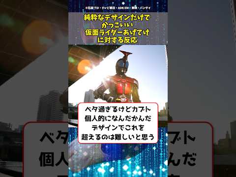
▶ Watch the original YouTube video
What Makes a Kamen Rider Design Truly Cool? A 15-Year Analysis of Pure Visual Excellence
A deep dive into the design philosophy behind Kamen Rider, exploring how visual aesthetics alone—without story or character context—determine whether a suit design achieves true coolness. An analysis spanning 15 years of the franchise reveals fundamental shifts in design philosophy across three eras: Showa simplicity, Heisei complexity, and Reiwa individuality.
What Happened
A YouTube video titled “Kamen Riders That Are Cool Based on Design Alone” sparked renewed discussion about what constitutes pure visual excellence in tokusatsu (special effects) design. The video prompted viewers to evaluate Kamen Rider suits based exclusively on their aesthetic qualities—silhouette, color, armor detail, and mask design—rather than narrative context or character development. This constraint revealed fundamental differences in how fans across generations perceive design coolness.
Why It Matters
The question of what makes a design “cool” without external context cuts to the heart of visual storytelling in tokusatsu. Kamen Rider, with over 50 years of history, has undergone radical design philosophy shifts. Understanding these shifts reveals how design language evolves to reflect changing production technologies, audience expectations, and creative intent. For designers, fans, and media analysts, this discussion illuminates the relationship between form and meaning in character design.
Background
The Kamen Rider franchise began in 1971 with a design philosophy rooted in simplicity: the original suit emphasized the concept of a “cyborg” through minimal ornamentation and machine-like geometry. Over five decades, design approaches have transformed dramatically. The Heisei era (beginning with Kamen Rider Kuuga in 2000) introduced “armor aesthetics”—complex, layered designs emphasizing metallic detail and geometric patterning. The Reiwa era (from 2019 onward) has pursued “individualization strategy,” with each rider breaking traditional silhouette conventions to express unique thematic concepts.
The original series creator, Shotaro Ishinomori, deliberately pursued simplicity to visually express the internal conflict of a human-machine hybrid. This design principle—where form directly visualizes narrative concept—became foundational to the franchise. However, as production technology evolved from practical suits to 3D CGI integration, designers gained freedom to pursue complexity previously impossible to manufacture or film.
Key Points
- Showa Era Design Philosophy: Mechanical purity through simplicity. The original Kamen Rider and subsequent Showa-era suits used minimal decoration and clear silhouettes to express the cyborg concept visually.
- Heisei Era Shift: Introduction of “armor aesthetics.” Kamen Rider Kuuga (2000) marked a turning point, emphasizing detailed armor plating, multiple color divisions, and geometric patterning—a move toward visual complexity.
- Reiwa Era Individualization: Breaking traditional design frameworks. Kamen Rider Zero-One (2019) and subsequent riders deliberately challenge what a Kamen Rider should look like, prioritizing thematic expression over franchise consistency.
- Silhouette as Foundation: The most important design element when evaluating “pure coolness” is silhouette—the shape remaining when color and detail are removed. Strong silhouettes (like Kamen Rider Black’s inverted triangle proportions) endure across decades.
- Color Strategy and Symbolism: Each rider’s primary colors symbolize thematic content. Black and silver express human-machine fusion; red and black express combat and danger; blue and black express duality.
- Mask Design as Identity: The mask is the rider’s face and first visual impression. Simplicity (original rider) creates mystery; complexity (modern riders) expresses specific concepts like AI or game mechanics.
Timeline
- 1971: Original Kamen Rider introduces minimalist design philosophy emphasizing cyborg concept through simplicity.
- 1972-1989: Showa era continues mechanical purity approach across multiple rider designs (V3, Riderman, Black).
- 2000: Kamen Rider Kuuga marks Heisei era transition, introducing detailed armor aesthetics and complex color schemes.
- 2001-2008: Heisei era establishes armor-focused design language with riders like Agito, Ryuki, and Blade.
- 2009: Kamen Rider Decade attempts to synthesize all previous design philosophies into a single suit.
- 2019: Kamen Rider Zero-One begins Reiwa era, deliberately breaking traditional design frameworks to express contemporary themes.
- 2020-2022: Reiwa era continues with Saber, Revice, and Geats, each pursuing distinct design individualization.
Perspectives
The Simplicity Argument: Fans who favor Showa-era designs argue that true coolness emerges from restraint. Kamen Rider Black’s enduring appeal—nearly 40 years after its debut—demonstrates that strong proportions and minimal decoration create timeless visual impact. This perspective values clarity and the mystery created by simplicity.
The Complexity Argument: Heisei and Reiwa fans contend that modern design complexity reflects evolved production capabilities and audience sophistication. Kamen Rider Ryuki’s dragon-inspired armor and Kamen Rider Saber’s multi-layered geometric patterns achieve coolness through intricate detail and thematic depth. This view sees complexity as visual sophistication rather than excess.
The Generational Divide: Online discussions reveal that “coolness” judgments often correlate with viewing generation. Showa-era fans prioritize silhouette and proportion; Heisei fans value armor detail and color harmony; Reiwa fans appreciate thematic conceptualization expressed through design. No single standard of “pure design coolness” exists across the fanbase.
The 3D CGI Factor: Modern production increasingly uses 3D CGI alongside practical suits, enabling design complexity impossible to manufacture physically. This technological shift has fundamentally altered what designers can attempt, raising questions about whether CGI-dependent designs can achieve the same visual authenticity as practical suits.
Design Evolution Across Eras
Showa Era: Mechanical Purity
The original Kamen Rider’s design expresses cyborg identity through geometric simplicity. The mask features large eyes and minimal mouth detail, creating an enigmatic expression. The suit emphasizes human form beneath mechanical elements—the “human wearing machinery” concept rather than “human transformed into machinery.” This design philosophy remained consistent through the Showa era, with variations like Riderman introducing asymmetrical elements to express humanity within modification.
Heisei Era: Armor Aesthetics
Kamen Rider Kuuga revolutionized design by foregrounding “armor” as a primary concept. The mask features multiple color divisions and geometric patterning; the chest plate displays intricate detail. This shift reflected both technological capability (improved suit manufacturing) and thematic evolution—riders became less “modified humans” and more “armored warriors.” Subsequent Heisei riders like Ryuki and Blade refined this armor-focused language, with each design pursuing increasingly sophisticated detail work.
Reiwa Era: Individualization Strategy
Kamen Rider Zero-One deliberately breaks traditional design frameworks. The oversized eyes resemble computer screens, expressing AI consciousness visually. Kamen Rider Saber incorporates book-inspired geometric patterns. Kamen Rider Geats features fabric-like texture alongside metallic armor, blending material contradictions. These designs prioritize thematic expression over franchise consistency, asking “what does a Kamen Rider look like?” rather than assuming established visual language.
Comparative Analysis: Kamen Rider vs. Other Tokusatsu
Understanding Kamen Rider design requires comparison with parallel tokusatsu franchises. Ultraman pursues “cosmic beauty”—sleek, elegant forms suggesting extraterrestrial origin. Super Sentai emphasizes “color diversity and teamwork”—bright, varied palettes expressing group identity. Kamen Rider uniquely focuses on “individual struggle and internal conflict,” resulting in darker, more complex armor designs expressing psychological themes visually.
This fundamental philosophical difference explains why Kamen Rider designs often appear more serious and introspective than comparable tokusatsu. The design language itself communicates isolation and conflict rather than heroic triumph or cosmic wonder.
Production Technology Impact
Practical Suit Constraints and Aesthetics
Showa and early Heisei designs were constrained by practical suit manufacturing. Materials included fabric, resin, and urethane—limiting what could be physically constructed and worn by suit actors. This constraint paradoxically created distinctive aesthetics: the combination of cloth and rigid armor pieces produced unique visual texture impossible to replicate in pure CGI.
3D CGI Liberation
Modern Reiwa designs increasingly incorporate 3D CGI, enabling armor complexity impossible to manufacture practically. This liberation has expanded design freedom but raises questions about visual authenticity. A design that exists only in digital form may achieve visual complexity but loses the tactile presence of practical suits.
Hybrid Approaches
Recent productions increasingly blend practical suits with selective CGI enhancement, allowing designers to pursue complexity while maintaining suit actor presence. This hybrid approach represents a middle ground between practical constraints and digital freedom.
Practical Guide: How to Appreciate Kamen Rider Design
Silhouette Analysis: Remove color and detail mentally, observing only shape. Strong silhouettes (Kamen Rider Black’s inverted triangle proportions) reveal design fundamentals. This exercise illuminates what designers prioritized and why certain designs endure.
Comparative Viewing: Place different-era riders side-by-side. Comparing the original Kamen Rider with Kuuga immediately reveals design philosophy shifts. This method makes abstract design principles concrete and visible.
Conceptual Research: Understanding design intent deepens appreciation. Learning that Ryuki’s design references dragons, or that Zero-One’s mask expresses AI consciousness, transforms visual elements from arbitrary details into meaningful expressions of thematic content.
Recommended Resources: Official design documents, creator interviews, and comprehensive design archives provide direct insight into designer intent. Books like “Kamen Rider Design Archive” detail the conceptual and practical process behind each suit.
Online Community Response
Twitter Consensus: “Kamen Rider Black’s design never ages” emerges as dominant sentiment, with thousands of retweets affirming that strong proportions transcend era. Conversely, criticism appears regarding Reiwa complexity: “Modern rider designs are too complicated; pure coolness becomes unclear.”
Forum Discussion: 5channel’s Kamen Rider threads frequently declare “Ryuki achieves peak design coolness,” suggesting Heisei-era armor aesthetics represent a design sweet spot balancing complexity and clarity.
YouTube Comments: Viewers note fundamental philosophical differences between eras: “Showa and Heisei design philosophies are completely different.” This observation highlights that “coolness” cannot be evaluated using a single standard across 50+ years of design evolution.
Underlying Pattern: Online response reveals that design preference correlates strongly with viewing generation. No objective “coolest design” exists; instead, different eras achieved different design goals successfully.
Insights
The question “what makes a Kamen Rider design cool based on design alone?” reveals that visual coolness emerges when a designer’s thematic intent achieves perfect visual expression. The original Kamen Rider’s black-and-silver palette expresses cyborg conflict; Ryuki’s red-and-black expresses combat danger; Zero-One’s oversized eyes express AI consciousness. When concept and form align completely, design achieves coolness independent of narrative context.
However, a paradox emerges with modern Reiwa designs: their complexity increasingly requires conceptual knowledge to fully appreciate. Saber’s design demands understanding the “book” theme; Geats requires recognizing fabric-versus-metal contradiction as intentional. This suggests design is becoming less “pure visual” and more “conceptually dependent.”
The franchise’s future likely depends on balancing Showa-era simplicity with modern complexity. The most successful designs may be those achieving the original Kamen Rider’s principle—where form directly and immediately expresses concept—while leveraging contemporary production capabilities.
Ultimately, analyzing Kamen Rider design transcends aesthetic judgment. It becomes a meditation on how visual language communicates meaning, how technology enables or constrains creativity, and how audience expectations evolve across generations. This analytical approach transforms casual fandom into genuine visual literacy.