▶ Watch the original YouTube video
Why Gundam SEED’s Red Beam Looks Like Shaved Ice: A 15-Year Fan Analysis of Viral Visual Design
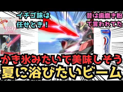
Gundam SEED’s distinctive red beam weapon has sparked widespread fan discussion comparing its appearance to shaved ice, strawberry syrup, and ketchup. This analysis explores the deliberate visual design choices behind the multi-layered beam effect, its psychological impact on viewers, and what it reveals about anime’s approach to color-coded visual storytelling.
What Happened
When Gundam SEED FREEDOM premiered in theaters, viewers immediately noticed the evolved visual effects of the red beam weapon. Social media searches revealed hundreds of fan comments describing the beam’s appearance as resembling shaved ice, strawberry-flavored treats, and other food items. Rather than criticism, these comparisons reflect genuine affection for the series’ distinctive visual language, sparking broader discussions about the design philosophy behind SEED’s color-coded weapon system.
Why It Matters
The red beam phenomenon illustrates how anime production prioritizes visual clarity and aesthetic appeal over strict physical realism. SEED’s approach to color-coding weapons by power level—using red for high-output beams and green for standard attacks—became a defining characteristic of the franchise. Understanding this design choice reveals how animation studios use color psychology to communicate information instantly to viewers, a technique that remains relevant across modern anime production. The 20-year evolution from SEED’s 2002 broadcast to FREEDOM’s 2024 release also demonstrates how technological advancement allows creators to refine visual concepts while maintaining their original identity.
Background
Gundam SEED aired from 2002 to 2003 during an era when late-night anime production faced significant technical limitations. The series introduced a deliberate color-coding system for beam weapons: red indicated high-output attacks, green represented standard beams, and other colors denoted specialized weapons. This design choice served a practical purpose—making complex battle sequences immediately comprehensible to viewers despite animation quality constraints. The red beam first appeared on the Strike Gundam’s Agni weapon and became consistently associated with powerful armaments across the SEED universe, including Freedom’s Balaena and Justice’s various beam weapons.
The multi-layered structure of SEED’s red beam—featuring a deep red center surrounded by colored plasma and an outer white plasma layer—is visually distinctive. This three-part composition differs significantly from other Gundam series, which typically employ single-color beam designs. The effect creates an impression of uncontrolled energy, reinforcing the “wild” and “powerful” nature of high-output weapons.
Key Points
- Visual Design Over Physics: The red beam’s multi-layered structure cannot be explained by conventional physics, representing a deliberate aesthetic choice prioritizing visual impact over scientific accuracy.
- Color-Coding System: SEED uses red for high-output beams and green for standard attacks, creating an instant visual language that communicates weapon power to viewers without dialogue.
- Psychological Learning Effect: Repeated exposure to “red beam equals strong attack” creates a conditioned response in viewers, similar to color-coding systems in video games and film.
- Comparative Uniqueness: Unlike Gundam 00 (which uses single-color beams) or Gundam Wing (which uses uniform yellow), SEED’s multi-layered approach is rare within the franchise.
- 20-Year Technical Evolution: FREEDOM’s red beam incorporates advanced plasma effects, dynamic particle flow, and environmental interaction that reflect two decades of animation technology advancement.
- Fan Interpretation as Affection: Describing the beam as “shaved ice” or “strawberry-flavored” represents creative fan engagement rather than criticism, demonstrating how audiences embrace distinctive visual quirks as endearing character traits.
Timeline
- 2002–2003: Gundam SEED broadcasts with original red beam design featuring limited multi-layer effects due to technical constraints.
- 2005: Fan began comprehensive Gundam series viewing and analysis.
- 2006: Early academic exploration of color psychology in anime, including SEED’s red beam design.
- 2024: Gundam SEED FREEDOM releases with significantly evolved red beam effects incorporating modern animation technology.
Perspectives
Design-Focused Interpretation: The red beam represents a successful marriage of practical communication and aesthetic beauty. The color-coding system solved a real production problem—making battle sequences comprehensible on limited budgets—while creating a visually distinctive signature for the series. The “shaved ice” appearance, rather than being a flaw, became an endearing characteristic that reinforces SEED’s unique visual identity.
Character Expression Through Weapons: The red beam’s “uncontrolled” and “rough” appearance intentionally reflects the Freedom Gundam’s thematic association with freedom and wildness. This contrasts with the Justice Gundam, whose weapons should appear more orderly and controlled. The visual design thus communicates character philosophy through weapon aesthetics.
Technical Realism Perspective: Some viewers question the physical plausibility of a beam that is red only at its center while white at the edges. This criticism, while valid from a physics standpoint, misses the fundamental point that anime prioritizes visual communication and aesthetic impact over scientific accuracy.
Fan Community Creativity: The widespread comparison of the red beam to food items demonstrates how audiences engage creatively with media. These descriptions reflect affection rather than mockery, showing how fans transform perceived visual quirks into beloved characteristics through playful interpretation.
Comparative Analysis: SEED vs. Other Gundam Series
| Series | Beam Color System | Multi-Layer Structure | Visual Clarity | Physical Realism |
|---|---|---|---|---|
| Gundam SEED | Red (high-output), Green (standard), Yellow (special) | Yes (red center + white outer plasma) | Very High | Low (design-prioritized) |
| Gundam 00 | Blue, Green, Red, etc. | No (single-color) | Moderate | Moderate |
| Gundam Wing | Primarily Yellow | No | Low | Low |
| Modern Gundam | Diverse | Yes (advanced versions) | High | High |
SEED FREEDOM’s Visual Evolution
The 2024 film demonstrates significant refinement of the original red beam concept. Where SEED’s 2002 version featured basic red and white composition, FREEDOM incorporates graduated color transitions (red to orange to white), dynamic particle flow during beam discharge, and detailed environmental interaction effects such as light refraction and thermal distortion. These improvements reflect two decades of animation technology advancement while maintaining the original design’s core identity.
Notably, other weapons also received enhanced treatment. The rail gun’s yellow beam, originally a simple colored line, now displays electromagnetic visualization effects that communicate the weapon’s energy nature more effectively. This evolution demonstrates the production team’s commitment to honoring the original design while leveraging modern technical capabilities.
The Psychology of Food Comparisons
Fan descriptions of the red beam as “shaved ice,” “strawberry syrup,” or “pickled plum” represent a form of affectionate engagement rather than criticism. This phenomenon reflects how audiences embrace distinctive visual characteristics as endearing traits of beloved media. The act of comparing the beam to familiar food items demonstrates creative thinking and emotional investment in the series.
This pattern aligns with broader fan culture behavior: audiences accept and celebrate perceived “flaws” in their favorite works as unique characteristics. The red beam’s distinctive appearance becomes a signature element that distinguishes SEED from other Gundam series, making it memorable and beloved precisely because of its visual distinctiveness.
Design Philosophy: Clarity Over Realism
SEED’s approach prioritizes instant visual communication. When a red beam appears on screen, viewers immediately understand that a powerful attack is occurring—no explanation necessary. This color-coding system functions as a visual language, similar to how video games use red enemies for fire-type attacks and blue for water-type. The technique proves remarkably effective for maintaining narrative clarity during complex battle sequences.
The multi-layered structure, while physically implausible, serves specific design purposes: the red center communicates danger and high power through color psychology, while the white outer plasma suggests uncontrolled energy and raw force. Together, these elements create a visual impression of overwhelming power that matches the narrative function of these weapons.
Insights
Gundam SEED’s red beam exemplifies how anime production balances practical constraints with artistic vision. Facing technical limitations in 2002, the production team developed an elegant solution: use color as a primary communication tool. Rather than relying on animation quality or detailed effects, they created a color-coding system that made complex information instantly comprehensible.
The beam’s enduring appeal—evidenced by continued fan discussion and creative reinterpretation—demonstrates that visual distinctiveness matters more than physical plausibility in entertainment media. The “shaved ice” comparison, far from being dismissive, represents how audiences transform visual characteristics into beloved identity markers.
The evolution visible in FREEDOM shows that successful design principles remain valid across decades. Rather than abandoning the original concept, modern production teams refined it, proving that good design transcends technological eras. The red beam’s journey from 2002 to 2024 illustrates how thoughtful visual choices create lasting impressions that resonate with audiences long after their initial broadcast.
Finally, the red beam phenomenon reveals the creative nature of fan communities. By describing weapons as food items and engaging in detailed technical analysis, fans demonstrate that media consumption is an active, creative process. This engagement transforms viewers from passive observers into active interpreters, deepening their connection to the work and extending its cultural relevance.